by Sarah Cage
It's no news if I tell you that the pandemic outbreak of Coronavirus : COVID-19, the newest member of the Coronavirus family, is at the moment, making waves all over the world.
Contents
This pandemic outbreak has since its inception engineered so many hashtags like:
Since every person is trying to stay safe and healthy, at home, keeping tabs on the spread of the coronavirus has inevitably taken the front seat as a way of pastime. Majorly, for interested groups of people who are eager to track its range across the globe. As usual, and even in these times, we still care about your everyday life. Always have been, always will be! We've packaged, just for you, useful info to help you keep tabs on its spread .
On the webspace, you'd come across several numbers of applications, maps, and dashboards . But how many of them can you trust? Tell me, don't worry, I'll wait! To keep your devices or gadgets safe from unwelcomed entities just as you are also staying safe, we've filtered and handpicked info and resources from sources of high reputation.
There's no need to add more issues to what the world is currently facing by misinforming the general populace. The info provided here is taken from notable sources. This pandemic outbreak of coronavirus has become a common problem for all. On that note, do well to go through the underlisted to assist you dutifully in keeping tabs on the virus as regards frequently updated info.
Note of Warning : The internet has grown to accommodate quite several unreal dashboards . They look very much similar to the genuine ones highlighted below. It comes with so much resemblance that if you aren't careful, you will fall so easily for it. These unreal or look-alike dashboards are crafted for one purpose- to load malicious stuff into your device or gadget secretly.
It's strongly advised that you limit yourself to the underlisted. The World Health Organization ( WHO ) and the John Hopkins dashboards are drawn from the sites of these organizations. Don't forget to check out the link of the websites just to be double sure you are not viewing a doppelganger. Also, do well not to download whatsoever from strange websites no matter the case.
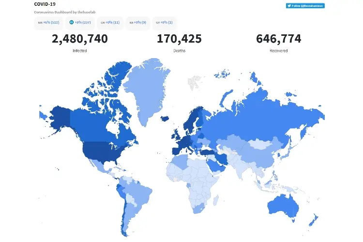
Most of these maps borrow data from the notable John Hopkins University, and it has its map. Amongst others, the John Hopkins resource data appears to come first in terms of precision.
What's Involved? |
● Note of Warning |
● Dashboards: 1. The John Hopkins Coronavirus Dashboard 2. HealthMap 3. NextStrain 4. This Map 5. The New York Times Dashboard 6. TheWuhanVirus |
● Frequently Asked Questions( FAQs ) |
● Links to Non-pictorial formats |
Let's check them out, starting with John Hopkins map:
The site, courtesy of its CSSE arm, that is, Centre for Systems Science and Engineering, has packaged an easy to navigate map to keep tabs on the spread of the virus across the globe. The data used are sourced from about seventeen references or origins with, of course, Centre for Disease Prevention and Control, WHO, and a host of others inclusive.
The COVID-19-LiveStat dashboard aggregates the number of confirmed cases by:
So, whichever way you desire your info or data, you get served well. To be honest with you, if you need a full house picture of the spread , then this is an excellent option to begin with.
I, for one, will give it to healthmap in terms of attractiveness and animations. The pictorial view is very receptive. Especially for those who love the dark mode settings , just like Whatsapp dark mode . The animation is most fascinating. The data are gathered from diverse sources, and you can animate the progress of the coronavirus even down to the new cases.
However, if the dark mode doesn't do it for you, you can settle for a much more colorful and brighter dashboard courtesy, the World Health Organization( WHO ).
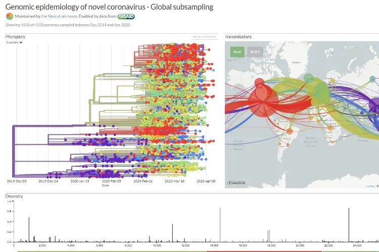
This is somewhat on the technical side. Yet, if you're yearning for more in-depth info on the virus, such as how the coronavirus has progressed to the extent in which it is now, NextStrain is your go-to map. It'll provide you with the exact info you seek.
It dissects everything for you, from the genetic makeup or structure of the virus, even down to a beautiful animation on the map. These animations point you to the way it has spread from one nation to the next. It may appear mystical, yet, intriguing to view.
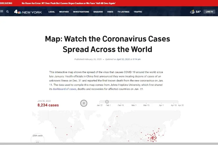
This map has its source from the National Broadcasting Company, New York ( NBC New York ). " This map " depicts the progress of the virus, starting from scratch down to the current state. It's well updated and gives on point info. It might not have an impressive and radiant look like others. But, the fact remains that it's simple to view and grasp the info.
This Map has a somewhat unique way of representing the data. Unlike most others, the spread is depicted by the magnitude of the bubbles used for representation. For most others, the intensity or size is marked by color. So, for the set of people having slight issues with colors and the likes, this may be of good use.
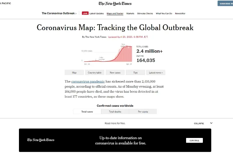
Considering the resource info devoid of maps and all, this dashboard( The New York Times Dashboard ) tops the chart. It provides the most grounded or structured and snatches and grabs charts. We all learn in different ways, some from text . For these kinds of people, the New York Times has got you covered. It gives a good list of stats, in text format, which tells you all you need to know about the current situation of the pandemic outbreak of coronavirus across the globe.
Adjunct : To reminisce on the beginning of the spread, you can check this video for more information:
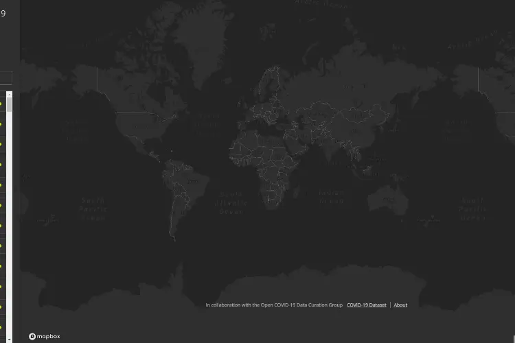
The map depicts a breathtaking display of the world swinging deeper into the dark mode as more nations get affected by the spread of the virus . You may not make do with it if you desire real-time feeds, particularly if you crave for raw data. Nonetheless, it's an excellent source to fall back on for historical citations .
Last but not least! TheWuhanVirus , probably named like that because of the proposed origin of the virus. This map depicts the progress of the virus in bicolor country shapes. The two colors used are white and red. The creator of the website has admitted he hasn't been as active as he was for some time now. But, he, however, made a statement that the site still gets refreshed, and new info is uploaded at least four times in the space of 24hrs.
We vehemently advise that you keep tabs of everything, follow the safety guidelines put in place by health organizations , and continue to maintain social distancing.
It is a big family of viruses that have a high tendency of causing sickness in humans or animals, as the case may be. As regards humans, this family of viruses is liable to cause several infections or illnesses relating to the respiratory system . The diseases include but are not limited to the common cold, Severe Acute Respiratory Syndrome ( SARS ), and many other whatnots. The newest member is the causative factor of the coronavirus disease, COVID-19.
In simple terms, it is the communicable disease provoked by the newest member of the coronavirus family. It was not known to the world until after the case erupted in China, Wuhan , to be exact in the closing periods of 2019.
On a global scale, the sickness caused by COVID-19 is not too severe. Particularly for kids and upcoming adults. But, the illness can also be alarming- 1 out of every group of people who are affected require intense care at the hospital. So, it's expected for you to get worried most notably about how the pandemic outbreak will affect lives and family.
Fortunately enough, all these anxiety and worries can be fueled and redirected into keeping each other safe. To start with, it's strongly advised to wash your hands thoroughly and keep up personal hygiene continually.
Also, be aware of the latest happenings and dutifully adhere to all recommendations by health bodies-especially regulations set concerning traveling, meetings, and activities.
As it stands, there is no definite proof or discredit that the virus can be spread via notes( cash ). But, particles from the respiratory system deposited from an already affected individual can survive on external surfaces . On this note, you are advised to wash both hands carefully and regularly after making contact with frequently used outer surfaces, banknotes, and substances. Desist from getting your hands in touch with your face generally.
To also be of help to others who may like updates on the coronavirus in a non-pictorial format. Do well to go check out the following links:

About Sarah Cage
Sarah Cage is an accomplished education writer known for her insightful and engaging work in the field. With a passion for empowering students and teachers alike, she has made a significant impact through her thought-provoking articles and research papers.
 |
 |
 |
 |
